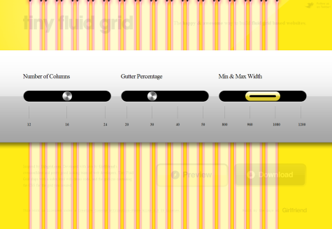
A few years ago, resolutions used by people going online were only a few, so designing sites using fluid layouts wasn’t something you had to do to be sure everyone’s happy. With the large scale introduction of wide resolution monitors, mobile devices like the iPad or the netbooks, fluid design became much more important, and so happened with tools created to help you get this job done. Today, we’ll talk about Tiny Fluid Grid, pictured below.
Tiny Fluid Grid was inspired by the 1KB CSS Grid and allows you to easily create fluid grids in just a few minutes, while offering the chance to customize three variables of the output: number of columns, min & max width, as well as gutter percentage.
Covered by the terms of the CC License, Tiny Fluid Grid can be downloaded as a package containing the index.html file with demo code, and the grid.css containing the CSS for the fluid layout you just created.
Compatibility: The online tool and the generated code itself should work with all major Web browsers.
